Download the design workbook (PDF, 2 pages) – print it or use it to structure your notes.
Estimated time: 15 minutes · Goal: describe the needs of a space and compare two surfaces.
Watch the short, silent introduction video with on-screen captions, then begin the teaching below.
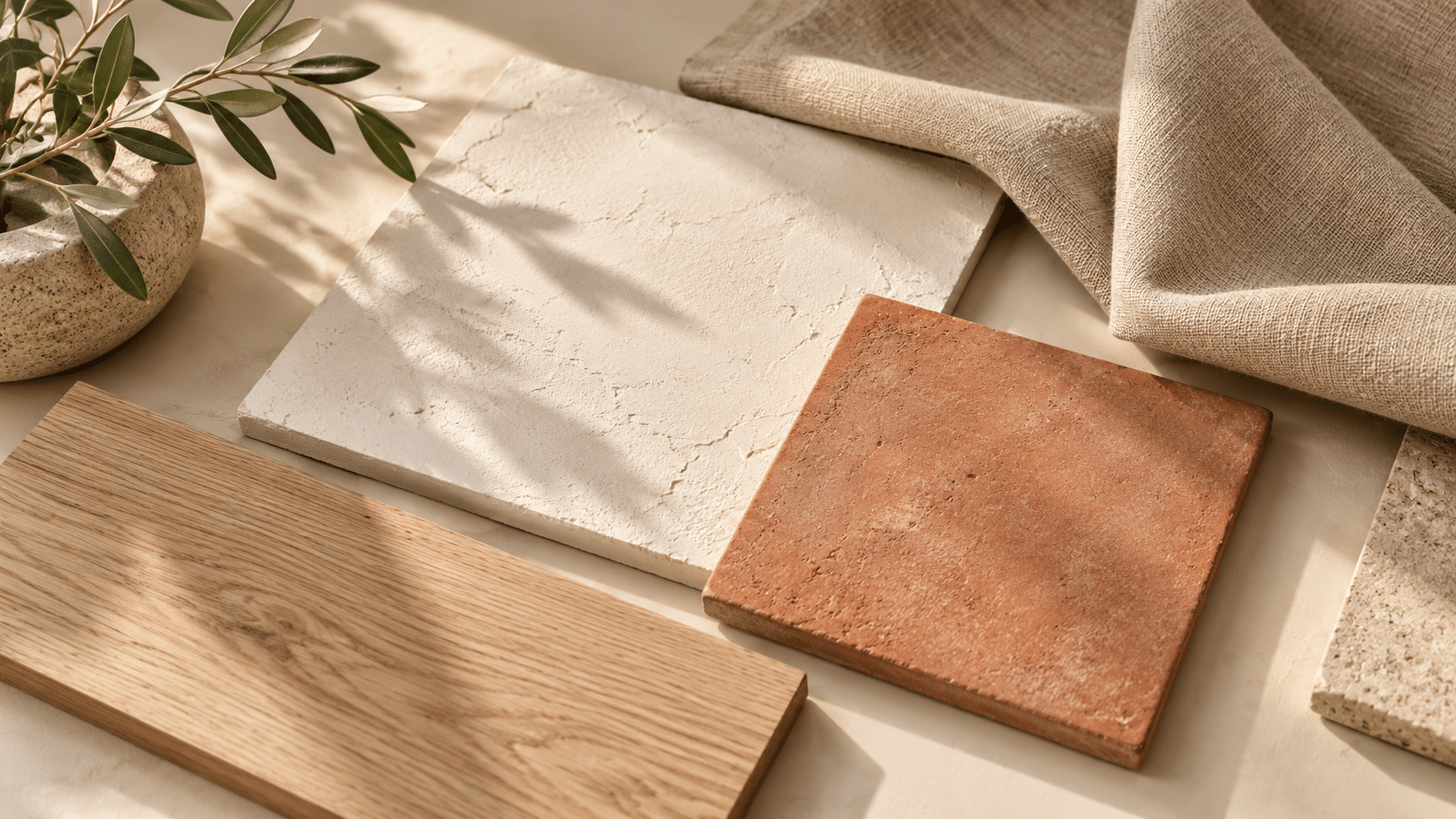
Start with purpose
Choose one clearly defined area, such as a reading corner. Planning an entire home at once can make decisions vague. Write down who uses the space, what they do there and what already works. A retained piece of furniture, floor or large textile is a starting point for the design.
Choose three mood words, such as calm, warm and clear. Use them to judge options: something may be attractive yet take your particular space in a different direction.
Observe four aspects of a surface
- Sheen: matt surfaces generally scatter a bright reflection more; glossy surfaces can show a sharper reflection of the light source. Neither is automatically better.
- Texture: linen often looks more irregular than smooth tile. Texture can make similarly coloured surfaces interesting without adding more colours.
- Pattern: wood grain or a bold fabric pattern already adds visual activity. A calmer adjacent surface may be enough.
- Use: appearance does not establish cleanability or suitability. List these as checks to make against the manufacturer’s guidance before purchasing.
Light is part of the plan
A sample can look different beside a window and at the back of a room. Lamps and neighbouring colours also affect what you see. Examine a sample in its intended place and orientation: wall samples vertically, tabletop samples horizontally. An image on a screen is an idea reference, not a reliable colour match.
Worked example: a reading corner
Keep an oak table and a light wall. The intended mood is calm and warm. Compare a smooth glossy surface with sand-coloured linen. The linen adds a sense of softness; a small glossy detail can catch the light. The whole room need not share the same sheen.
Exercise 1: observation notes
- Name the space, its user and its purpose.
- Write three mood words and one feature you will retain.
- Choose two surfaces; describe their sheen, texture and pattern.
- Compare them under two lighting conditions. If evening light is unavailable, mark this observation as still to do.
- Write one decision and one thing you do not yet know.
Before continuing: separate an observation (the surface reflects the lamp) from an interpretation (it feels formal). Both help, but interpretation is personal.
Video transcript
Look at a surface and notice light and texture. Build a three-colour palette: one calms, one supports and one adds an accent. Our example is warm white, sand and terracotta. Choose three colours around you, compare daylight and evening light, and record an observation in the exercise.
Mark the lesson complete and continue to palette design.